I hope at least it’s good.
I’ve been cogitating, um-ing and ar-ing over doing a complete overhaul of my shop. When I say complete, I mean the name, url, IG page, everything.
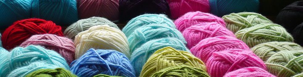
The main driver for it is that I am mainly weaving and crochet more than anything else. It’s about all I have time for once I get to the part of the year with good weather and the demands on my time from the garden.
Winter is great for side hustles. Rubbish weather means plenty of indoor weekends.
No all I need to do is get the other half to find a hobby! 😆
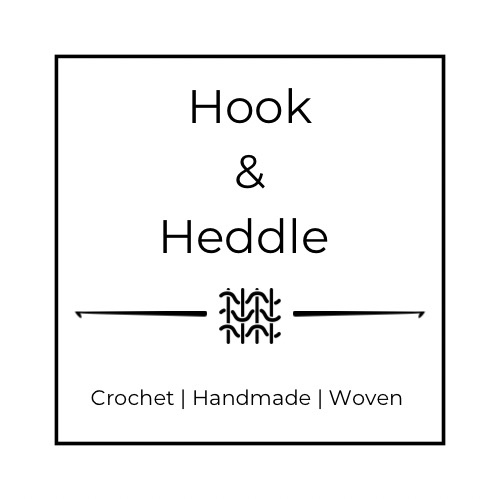
Anyway, I’ve settled on a new name which I think is better. And a new logo. Love your feedback.

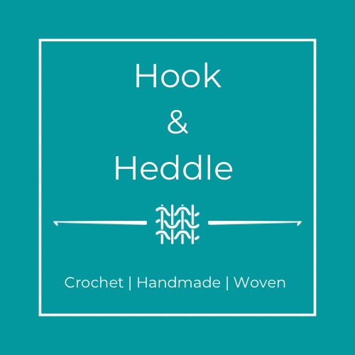
Thoughts on colour. Not sure 100% yet. I have one in white background and black font.
I’m still keeping my current IG profile which is linked to this blog, but I need to separate the personal from the more business side. Only this week I had the current IG profile cause issues within my Pedddle shop access because of the different names.
So, while it’s a real faff in the short-term to change everything, it should be better in the long term. And better to do now while it’s still early days.
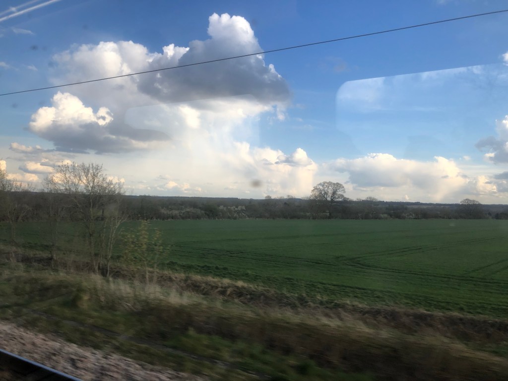
For the next few days I’m office to Brussels for a long weekend. Heading to London first on the train. Snapped these as we zoomed passed cloud bursts of rain in the otherwise bright blue sky.

Watch out for most posts and updates. Have a great weekend wherever you are.


My thought on the logo are that I like the white writing on a coloured background better than the black on white. Of those two: the Royal blue calls attention to itself more, but the other is more cuddly and maybe even more classy. Just my gut reactions.
LikeLiked by 1 person
Thank you. Useful input to have. When you dig into logos it’s all about colour theory and it’s impact on peoples brain.
LikeLiked by 1 person
Thanks for update.
LikeLiked by 1 person
Liking the Tealy green logo more. ☺️
LikeLiked by 1 person
Thank you. It’s a softer colour which I did first. I do like it.
LikeLike